Dark themes recently attracted a lot of attention since enterprises such as Apple or Google deployed on most of their operating systems — iOS, macOS, Android —, an alternative to the default interface colors which were mainly light.
Microsoft followed the trend and added the same option on Windows. While it is a great feature to allow people to use their computer or mobile at night without hurting their eyes, this implementation is incomplete. Indeed, to make this feature really shine, having the operating system interface dark is not enough. Developers must follow the rules too and add a dark theme to their softwares. Otherwise, it’s pointless.
More importantly, web developers have also to think about adding a Dark Theme option to their websites otherwise, no matter if your OS interface is light or dark, the website will still look as before. And if, just like the homepage of Google, it is full of white and very bright, it would be awful at night to browse, even more if your OS interface is set to dark.
Fortunately, it is easy to quickly create a dark version of a website, thanks to the “prefers-color-scheme” property added to the CSS specifications.
# Detection of the Operating System colors
The CSS media feature prefers-color-scheme can take two values: either “light” or “dark”. It allows web developers to adjust the design of their website if the Operating System interface of the user is set to the default one — most of the time, the “light” one —, or to the “dark” one.
For example, if we want to change the background of our website to black if the user has the Dark Mode option enabled on its OS, we can simply do:
/* style.css */
/* change background color if the OS is on Dark Mode */
@media (prefers-color-scheme: dark) {
  body {
    background-color: #000 !important;
  }
}
This is very handy as we can now detect the interface mode of the user and adapt the colors of our website to match it.
More interestingly, this CSS feature will detect the OS interface change instantly. For example, on macOS, you can schedule your OS to automatically switch the interface from light to dark at sunset. And the contrary at sunrise.
Every app will then change its colors too. This is very cool. And if this switch happens when you are browsing a website that uses prefers-color-scheme, it will use the dark colors automatically, without having to refresh the page.
Now, how to implement that nicely on an existing Ruby on Rails app?
# Dark Mode on Rails with SCSS
For most of my web projects, I like to use Ruby on Rails either for quick prototyping, either for real projects deployed in production. This is the case for whatthemovie.com, a movie quiz game, where people upload movie snapshots and the other players have to guess from what movie the image was taken.

Like many other Rails apps, it heavily uses the Assets Pipeline to handle assets — images, javascript, fonts, stylesheets etc.
Unfortunately, our design is quite outdated and not modern at all — it is from 2008, literally. For example, our buttons were made out of images to have colors gradients where nowadays, you can simply use the linear-gradient CSS function to do the same, in one line! My point being: it will be more difficult and need more work if your design is old.
If you use for example CSS variables, you will see that it will be more easier to create a dark mode and quicker because you basically just have to change the colors of these variables and you are done.
# Create a dedicated Dark Mode SCSS file
The first thing we have to do is to keep files organized and respect the Assets Pipeline guide. Therefore, to create our Dark Theme, we will add a new file named darkmode.scss to the Pipeline in app/assets/stylesheets.
We also have to make sure our Rails app will now integrate this file and its content to the CSS file we will have in production. To do that, we add a reference to our new SCSS file in application.scss.
/* app/assets/stylesheets/application.scss */

/*
*= require main
[...]
*= require darkmode
*/
Make sure to require the SCSS file at the end, after everything else is already included. Since we are going to change or overwrite styles, it is important to add the Dark Theme after everything is set up.
Now it is time to stylize our website with some dark colors! For that, we are going to use a combination of SCSS functions such as mixin and include, HTML data attribute and a ruby gem to save and retrieve the user preference.
See the SCSS mixin feature as a way to define styles that you wish to re-use later one or more times without having to maintain numerous versions of the same thing. We are going to create a mixin called “dark” that will contain any change that makes our elements, selectors, identifiers, darker.
/* app/assets/stylesheets/darkmode.scss */

/* change background color if the OS is on Dark Mode */
@mixin dark {
  body {
    background-color: #000 !important;
  }
}

@media (prefers-color-scheme: dark) {
  @include dark;
}
The content of mixin “dark” will automatically be included in the section where it is called. This is a silly example to introduce the concept.
Now, we need to think about how handle what the user really wants. Every possible scenario.
# Three options: automatic, light, dark
While creating a dark version of our website that will follow the user OS interface colors sounds nice, it might not respect what the user really want.
For example, a user might want to use its OS interface with light colors but browse the website with the Dark Theme enabled. Same in the opposite direction: a user with its OS interface set to dark might still want to browse our website with the old light theme.
Therefore, we have three scenarios to handle and to offer as options to the users:
-
Automatic Mode: This option describes what we talked about earlier. The website will follow the user OS interface colors automatically. If the OS interface is set to light, the theme on the website is light. If it’s dark, the theme will be dark ;
-
Light Theme: This option forces the use of the old light theme, no matter what the user OS interface is set to ;
-
Dark Theme: This option forces the use of the new dark theme, no matter what the user OS interface is set to. This is handy as many users don’t run on an OS that provides a light and dark mode. Therefore, if they want to use the dark theme, it is the only way.
This is where SCSS features and HTML data attributes really shine. To handle these three scenarios, we will use a data attribute called data-color-mode that can take three values : “auto”, “light” or “dark” — these values will reflect the user preference. And we are going to use it, in combination with mixin, include and prefers-color-scheme, to offer this dark theme to everybody:
/* app/assets/stylesheets/darkmode.scss */

@mixin dark {
/* all the colors/css changes to make the website dark */
}

/* force the dark mode when OS interface is light */
@media (prefers-color-scheme: light) {
  [data-color-mode="dark"] {
    @include dark;
  }
}

/* follow the OS interface colors or force the dark theme */
@media (prefers-color-scheme: dark) {
  [data-color-mode="auto"], [data-color-mode="dark"] {
    @include dark;
  }
}
With this code snippet, we now handle the three possible scenarios: if the user has an OS interface set to light but want to use the dark theme anyway etc. We now have to let the user pick what option it prefers, saves it, retrieves it and sets it inside the HTML data attribute data-color-mode.
# Store and retrieve user preferences regarding appearance
To keep the user settings on our website, we use the Ruby Gem preferences. It is very easy and simple to use. I highly recommend it. To add a user setting to store, we add this line to the user model:
# app/models/user.rb

[...]
preference :theme, :string, default: 'auto'
With this line, we store the user preference about the website design as “theme” and set it to “auto” by default.
Now let’s edit the user settings form to add the ability to change the theme and save the user choice:
<!-- app/views/user/settings.html.erb -->
[...]
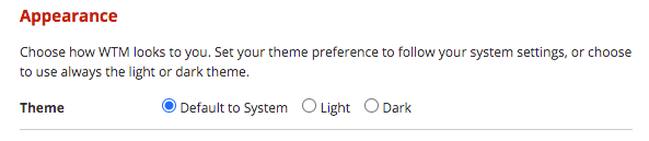
<h2>Appearance</h2>
<p>Choose how WTM looks to you. Set your theme preference to follow your system settings, or choose to use always the light or dark theme.</p>
<ul class="standard_form">
<li>
<div class="title">Theme</div>
<div class="content">
<%= f.radio_button(:prefers_theme, "auto") %>
<label for="user_theme_auto">Default to System</label>
<%= f.radio_button(:prefers_theme, "light") %>
<label for="user_theme_light">Light</label>
<%= f.radio_button(:prefers_theme, "dark") %>
<label for="user_theme_dark">Dark</label>
</div>
</li>
</ul>
It looks like this:
The last thing to do is to add our HTML data attribute data-color-mode in our main application layout and set its value to the user preference we retrieved from the database in order to make our SCSS features work:
<!-- app/views/layouts/application.html.erb -->

<html data-color-mode="<%= (@current_user&.preferred_theme || "auto") %>">
We make use of the Safe Navigation Operator &. introduced in Ruby 2.3 to handle the case where the current visitor/user is not logged in to our website. If it is not logged in, it will return nil and set the data-color-mode value to “auto”. If the current user is logged in, it will retrieve its preference regarding the theme of the website and set the correct value in the data attribute.
And now we are done! We have added a Dark Theme to our website!
 Our new dark theme!
# Some caveats
Since our design is very old, this approach was quite nice and easy to implement. Unfortunately, it comes with some weird behaviors. Indeed, the CSS file generated by SCSS and the Assets Pipeline is, in our case, very large.
It seems the compiler needs to add in front of every element, selector or identifier, the data attribute, like this:
/* generated CSS file */

[data-color-mode="auto"] ul.disclist li a,
[data-color-mode="auto"] .profile_info a,
[data-color-mode="auto"] .profile_user_links li a,
[data-color-mode="auto"] .thumb_overlay a span,
[data-color-mode="auto"] li.sotd h4 a,
[data-color-mode="auto"] #online_users .footer_box a,

[data-color-mode="dark"] ul.disclist li a,
[data-color-mode="dark"] .profile_info a,
[data-color-mode="dark"] .profile_user_links li a,
[data-color-mode="dark"] .thumb_overlay a span,
[data-color-mode="dark"] li.sotd h4 a,
[data-color-mode="dark"] #online_users .footer_box a {
    color: #7C7C7C !important;
  }
It results to a file with a lot of lines generated. While this might not be that much a problem to us, it might be to you. Unless, as we talked about it earlier, your design is well done and makes use of CSS variables. In that case, the generated code will be very small since you just have to changes the CSS variables values.
Even if I don’t recommend it, I found a way to optimize the compiled CSS file by combining the data attributes when the value is set to “auto” or “dark”.
Instead of checking for the values “auto” and “dark”, I only check for the presence of the letter “a” with [data-color-mode*="a"]:
/* app/assets/stylesheets/darkmode.scss */

@mixin dark {}

@media (prefers-color-scheme: light) {
  [data-color-mode*="d"] {
    @include dark;
  }
}

@media (prefers-color-scheme: dark) {
  [data-color-mode*="a"] {
    @include dark;
  }
}
This trick makes use of the *= attribute selector and basically says: if the data-color-mode value contains the letter “a”, then do something. Since both “auto” and “dark” contains this letter but not “light”, it works!
I did the same for [data-color-mode="dark"] alone to reduce the number of letters by a few. This little method lead to the removal of more than 400 lines.
I posted on StackOverflow asking for help to optimize this without having to remake all my design but so far, no answers. If you have any ideas, please share them!
# Accessibility
Something you have to keep in mind when you start making a dark theme for your website is accessibility. There is nothing more painful to read a text on a dark background when the text color was badly chosen.
When you create your Dark Mode Color Palette, think about it: does the text will be readable? Does the contrast between these two elements is enough?
GitHub, who recently released a Dark Theme for their website, received some criticisms about this because of the lack of contrast between some elements.
Fortunately, the Web Content Accessibility Guidelines (WCAG) helps us to choose the correct colors by calculating the contrast ratio between elements.
They have defined two levels of accessibility regarding this:
-
The level AA: it needs a contrast ratio as above 4.5 ;
-
The level AAA: as above 7 for small text.
Where the level AAA should be the objective, acheving the level AA is already nice1.
To help us calculate the contrast ratio between elements, you can use the Developer Tools of your browser: when you open the color picker of a text element, you can see the contrast ratio with its background and the two levels thresholds.
If your browser doesn’t have such a feature, multiple websites like WebAIM or Coolors provide a way to calculate easily the contrast ratio between two colors.
# Conclusion
Without that much work, we were able to add a Dark Theme to our existing Ruby on Rails application. Despite not being a web developer or a web designer, our little theme quickly made seems to have gained some success: more than 74% of our active users have enabled it by default, and it doesn’t include users who enabled the “automatic” mode that automatically switches the theme from “light” to “dark” and vice versa.
When you think about it, it makes sense that a website about movies, displaying movie snapshots with cinema benches and curtains around them, provides a better experience to the users with dark colors everywhere.
-
Of course if you can respect both levels, this is awesome. But I found out, in my case, that trying to achieve the level AAA for small texts was sometimes very hard. ↩